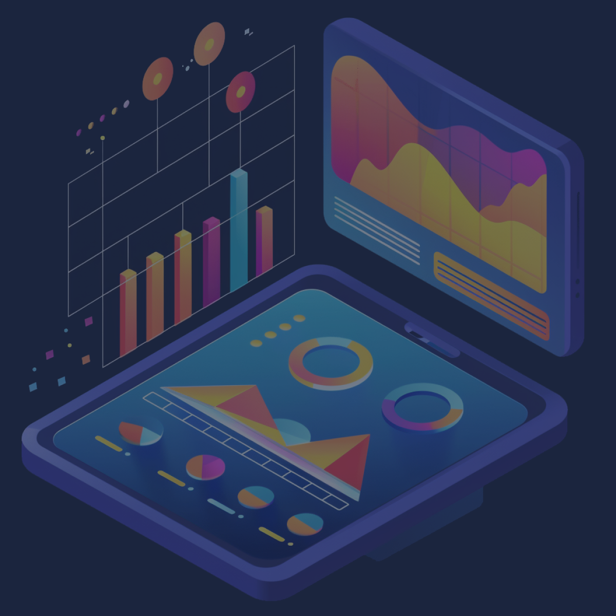


How to Visualize Your App’s Google Play Store Metrics in Looker Studio
Android App Development

At the beginning of every year, discussions surrounding most mobile app design trends become important for digital agencies like Blue Label Labs. These trends will inevitably affect each and every one of us in some way whether or not we go out to buy the “latest and greatest” tech.
Some are jumping to purchase the latest smartwatch or foldable tech, but I see that the most important changes to mobile technology root in app design trends that affect us developers and most importantly, the end-users for whom we develop products. Let’s take a look at some of the most critical design components for mobile tech that recently hit the market and discuss the major trends for this year.
Of everything we’re about to look at, the epicenter of virtually all mobile app design trends is the UX. When you release trash to the market you’ll probably make some money for a minute but eventually, your polished turd loses its luster and becomes plain shit.
Device manufacturers and platform developers at Google, Apple, and so on consider optimal features for prioritization in major updates – next, it’s up to us developers to ensure new features work as intended for the apps we develop. For example, convenient new tricks that came along with iOS 13 raise the bar higher and can make for a better UX with good development practices.
Enhanced security by using your Apple ID to login to different apps, locked-down Bluetooth permissions for individual apps and greater restrictions on sharing notes saved with contacts don’t exactly make using the device more a complete thrill but knowing you’re safer means a better experience with the latest iteration of iOS. For example, using the Apple ID to authenticate adds convenience for the user and improves safety by removing the possibility of compromised credentials should the system powering that app become victim to malware or some other malicious act.
In another example, some people love features like dark mode – it’s a simple novelty for some however, those with lighter skin and eyes often experience some degree of photophobia. Even if you don’t fall into this aesthetic category, you’ve likely experienced something similar the morning after closing down a bar with your friends. Many developers will be looking to integrate this feature into their app in the coming few months.
Other features that make accessing settings or quick reply capabilities like in Android 10 mean the device simply becomes that much more functional for the end-user. Anything that makes an app or core process easier to use or safer is a crux for developers, like those of us Blue Label Labs, who are building apps for both internal business use or widespread consumer deployment.
Several upcoming mobile app design trends will become more prominent this year. The following are among the biggest projected trends for the year 2021.
Motion graphics and motion effects. It seems like a novelty for some, but the ability to embed motion animations can add substantial depth to digital storytelling – as such, the capability to use borderless images has become more important for content creators in entertainment and other businesses alike. One good example is cinemagraph media that’s become popular for pop culture content creators which helps draw in and retain some readers. Yet, the application extends beyond the ability to entertain readers.
One of the best examples on the market is the mental healthcare app, Headspace. As their goal is to help people achieve mindfulness in multiple stressful areas of life, they have carefully cultivated an affable set of animations that Invision describes as “show and not tell.” Watch the short video below to see how Headspace’s William Fowler and Vicki Tan describe how these animations are more conducive to teaching users a skill:
The Business Value of Animation with William Fowler and Vicki Tan of Headspace
Headspace’s Programming Director of Sleep William Fowler and Lead Product Designer Vicki Tan reveal how animation plays a pivotal role in previewing the app …
Health insurance company, Oscar, also uses motion graphics to communicate their story and make connections with customers and prospects. This is a novel approach for the industry as health insurance here in the US typically feels like a nightmare at every turn. In doing so, the more “human” method of storytelling builds greater trust for viewers versus the industry-standard boilerplates that basically say something to the effect of we-have-you-covered-at-affordable-rates-sign-up-now-lol.
Unique illustration and bold typography. This mobile app design trend relates to the bit about photophobia from the previous section. In some cases, these kinds of accessibility improvements are just convenient. Other times, they allow content to be viewed in a more dynamic manner or more importantly, make a huge difference for people with vision-related disabilities.
While great illustrations and help with visual acuity issues and disabilities like dyslexia, they extend beyond simply increasing accessibility. Bold type is used throughout a new app we’re developing at Blue Label Labs known as inHouse. This platform connects diners to restaurants in cities around the world by offering them a unique experience with the intent of developing more regulars for a location.
Another solid example is Great Jones – this cookware company started by two childhood friends offers great illustrations around fantastic photography throughout their site to showcase their high-quality products. Aside from bold type, small visual elements that appear as you scroll product pages add an engaging flair that keeps the viewer scrolling through the page.
Responsive colors based on context. The most historical issue with selecting a brand image (especially colors) is that they’ve been static, meaning the capability to change colors on the fly hasn’t been a huge focus in the past. Some select lively color schemes that make sense in the context of their own brand but look odd when juxtaposed against other brands.
In situations where companies partner with other brands for any given reason, web ads and printed materials can end up looking like a 6-year-old who was tasked to get dressed in the morning before school. More homogeneous color schemes are helpful in keeping marketing digital marketing material less “busy” for collaborative efforts which typically end up being more distracting than captivating.
The most important way responsive colors play a part in current and upcoming mobile app design trends is by facilitating better cognitive responses to marketing campaigns. The psychology of color tells us humans in different regions respond differently to various schemes. Too, some campaigns are better served with a palette that may not use a company’s core colors typically seen in their logo or used on their website.
Though it’s a couple of years old, there is a great article on the digital publication Smashing Magazine (a that also makes wonderful, responsive color choices) about how colors make huge differences for readers. While it doesn’t quite go into the responsive portion of color choice, all the information about what kinds of schemes work for different campaigns and platforms is at least touched on.
Asymmetrical layouts. Such layouts serve a few different purposes for both aesthetics and functionality.
Though most of us are inherently attracted to symmetry, asymmetrical designs serve visual purposes by directing the eye in a motionless graphic. These serve to steer people’s directions to call to actions which ultimately help to increase conversion. Too, UX of foldable displays will be heavily dependent on the ability to produce effective layouts around different bending and folding capabilities. For us devs, some of us might need to revisit some calculus and likely reacquaint with Hooke’s Law!
The commerce platform, Shopify, does a great job of explaining asymmetrical layouts, when to use them, and why it’s not necessary to focus too strongly on symmetry. A good example of a popular brand that uses asymmetry for a portion of their digital endeavors is the New York Times on their live performance and conversation platform, Times Talks (as seen above.) Too, Oscar that was mentioned in the ‘motion graphics’ point does a great job of using an asymmetrical design on their site as well.
Storytelling and UX writing. If you’re asked to think of your favorite book, it’s likely that a novel with little to no pictures comes to mind. The reason you enjoyed the book is because of the imagery you pictured because of good storytelling.
Storytelling through UX can be used to entertain, but it serves functional business purposes. Storytelling design and UX writing can be used to engage audiences and make information more digestible by clarifying complicated ideas.
Mobile app design trends that adhere to a storytelling format are like any other good media – the more engaging your story, the better your ROI which is heavily emphasized by marketing platform, MailChimp. They offer great insight throughout this blog that covers the importance of tieing elements such as content, photos, social media, your logo, and basically everything about brand together in a cohesive story.
One excellent example of a product that was born from a story is the communication platform, Slack. They built the Slack tool we know today for in-house purposes but realized it had value, well, everywhere. Not only are they a leading communication service, but they’re also helping companies like Duarte Inc. tell their stories as they recognize the value of storytelling and UX writing. Case in point, this design trend allows brands to become more human and hence, more relatable.
We keep up with shifting market dynamics like meteorologists monitoring the weather – insight into complex marketplaces enables us to design and build around current and future developments for the lifecycle of a digital product. Engaging your audiences moving through 2020 requires adhering to mobile app design trends that bring value to the UX. Motion effects, responsive color schemes, and really considering every aspect for layout drives users to action which is the bedrock in getting the most – whether it’s simply delivering content or selling products – to your audience.
Touch base with us at Blue Label Labs to see how our processes make use of modern innovations in mobile app designs to maximize the effectiveness of your product.