


3 Important Trends to Innovate in Agriculture in 2024
App Design & Development

Most of us in the development business will say that the UX is the basis for greatness and as such, it’s imperative developers avoid making some common UX mistakes. Of the roughly 2.2 million apps available across both Google Play and the App Store many sit around collecting figurative dust because developers failed in one or more areas.
To make something great, it requires a degree of empathy where businesses and developers need to step outside of themselves and walk in the shoes of the user. It’s through these kinds of connections that developers can make a product that truly resonates with their audience. Let’s start by first taking a look at what UX matters then we’ll move on to discuss some classic mistakes that drive apps to the bottom of the app store lists.
It should go with saying but if your users aren’t having a good time, then it’s probably because you’re leaving something to be desired. In the same sense that a host is obligated to entertain their guests, an app needs to be able to accommodate its users. As businesses, we need to be able to step outside of ourselves to ensure that the products we produce satisfy the needs of the userbase.
Your UX is essentially the combination of every underlying component of your product as it works together to solve some problem. Underneath the layers of functions that make it all work is purpose – as such, businesses need to ensure that purpose is taken to heart with each step of building a digital product. When there isn’t a purpose, the intent behind processes loses meaning which is often reflected in shoddy or lacking development.
A good example of a business that has created a great UX through a digital product is the DMV. Historically, people have avoided (or at least dreaded) visiting these locations because they’ve had a shitty experience. To combat this issue, most states have launched great digital products that users can turn to instead of dealing with unnecessary issues that make the in-person experience miserable like waiting in long lines or arriving without some necessary paperwork required to complete a service. It’s not nearly as inconvenient when you’re at home and simply need to find some document to scan and upload to their system compared to finding this out after waiting in line for an hour.
States that have successfully embodied the experience they want to convey in their products have done so as a result of listening to feedback. Creating a sustainable product has its roots in listening to what your audience wants and from there, it’s up to you to deliver.
There are plenty of ways to screw up an app. Keep the following in mind when building your digital product.
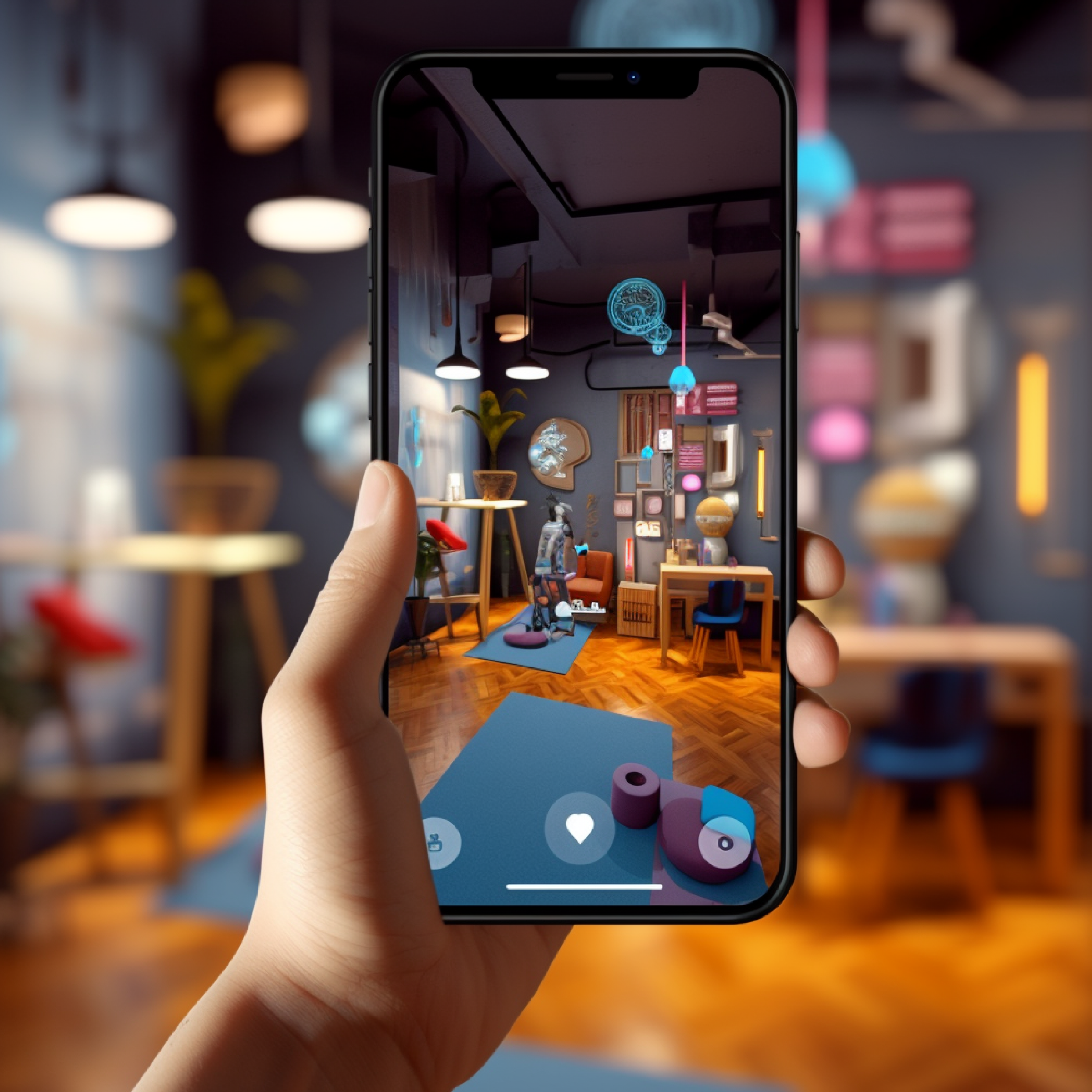
All kinds of problems can stem from a bad UI that in turn makes apps frustrating to use. Controls and elements in the app should be clearly visible, meaning the layout needs to be on point. Features should feel intuitive and when they’re not, a short tutorial overlay should be included to clarify what each element accomplishes. You can see some examples here on this Pinterest page that’s compiled several great examples from various apps.

From MC Johnson on Pinterest
Some create their entire experience based solely on assumptions which is exactly why you need to test. This was a major problem with Quibi and why it eventually failed. It sounded great on paper – provide original content in a short-form format that users can easily watch from mobile devices. It ultimately never caught on despite a substantial investment because it turns out that potential users didn’t care and Quibi was unwilling to adapt to their audience.
Going back to point one, overly complex systems, even with a responsive UI, can be irritating. Burying useful features under layers of menus slows down users and makes using the app a drag. Think about the path most users will want to take and make sure that this comes through as simple as possible. The popular Weatherbug app for Google Play and the App Store is a great example of an app that used to have a confusing layout as simple weather information used to be buried underneath digital clutter and intrusive ads. Today, information like temperatures and map data is easily accessible through clearly defined links at the top of the app’s main page.

Nice, right?
Is the problem you set out to solve actually being solved? Some apps only half accomplish what they set out to do, much the like IRS app available on Google Play and the App Store which is a paragon of UX mistakes. While it’s great for people who file paper returns that want a confirmation that their forms have been received, most users want a more concise time frame for their returns which the IRS doesn’t provide. If you’re expecting a return and have used the app, you know that it only shows a pending status up until the day they decide to release funds. As such, the app is kind of a pointless tool.
Modern design trends not only make your software look up-to-date, but they also make a significant contribution to the UX. Something as simple as effectively using motion to direct users’ eyes and incorporating great storytelling helps keep users engaged. While some apps are straightforward and inherently intuitive, a little feedback will help show you areas you might need to tweak to ensure that users are getting the most out of your app’s design.
After you’ve produced an MVP, there’s still plenty of work to be done. To get to that point, you’ve hopefully conducted a substantial amount of testing and feedback to build your product’s baseline. It doesn’t stop there as you need to continually look for ways to improve by listening to user feedback whether it’s from your app store reviews or otherwise.
Keep in mind that just because you got off to a good start doesn’t mean that it will always be that way. Failure to listen to what your users want will cause your product to wane early in its lifecycle and fizzle out before its time.
At Blue Label Labs, we employ the best-of-the-best to build software for everyone from the sole entrepreneur to the Fortune 500 company. Regardless of what industry we develop for, we ensure that we avoid classic UX mistakes to keep users stay engaged throughout a product’s lifecycle. Get in touch with us today to find out how we can help you deliver a fantastic UX.