


3 Important Trends to Innovate in Agriculture in 2024
App Design & Development


It’s easy to get wrapped up in all the creative processes for the big thematic elements of your metaverse from the environments, soundtracks, characters, features, and other big stuff when you take the plunge to build your own metaverse.
However, a bad UX in your menu system UI can cause issues ranging from frequent complaints to total abandonment.
We’re going to cover the baseline for elements you should aim to include in a menu UI then we’ll wrap up with a couple of contemporary examples found in two of today’s most popular games.
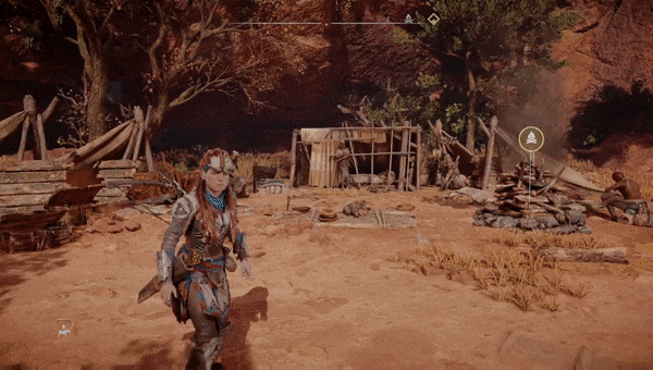
While playing the twin-stick shooter Alienation on PlayStation with a friend, I complained about how long he was taking to go look at his inventory at every opportunity.
His reply was simply, “Be glad it doesn’t have the glorious Resident Evil 4 inventory management or we’d never play the actual game.”
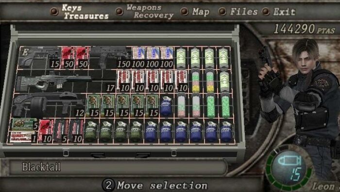
If you had even a minor compulsion to organize, you spent a lot of time in these over the decades. | Source: Reddit
Not only has the franchise received acclaim over the decades for good gameplay, the menu system has been praised as well. The main takeaway here is that this system works well for this particular digital product (and Neverwinter Nights, among others) not that it’s the “ultimate design” (though it does lean heavily on that soothing compulsion to organize.)
Fall off a bike as a child: you bounce back in short order. Fall off a bike after 30: you’ll survive but with a broken collar bone.
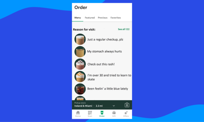
The same holds true for other apps – a layout that works well for the Starbucks ordering UI might not go over so well for a social media app. With that said, there can be some overlap as this design would work well in a healthcare booking app as you can see from the image above.
Much like how a wizard is never early or late, a great menu does exactly what it needs it to. Nothing more and nothing less.
A menu should clearly display as much uncluttered, relevant information as possible so the user can confidently interact with objects and navigate with ease – when items need supplemental content, additional content should be added in “layers” or additional, on-screen elements like contextual overlays that users can toggle through.
Users should also have a clear idea of where they are and what they can accomplish in any given area via clear labels, obvious contextual clues, or a mixture of the two.
Some of the most common elements you’ll find in existing and upcoming metaverse UIs are:
Inventory systems used to manage in-world objects
Transactional systems used in exchanges of virtual goods, virtual currencies, and fiat currency
Development systems for characters, objects, environments, etc.
Let’s look at a couple of quick examples from a couple of popular, contemporary series to see how they’ve improved over time. As with any digital product, you’ll get the best results when you analyze user behavior and make improvements over time.
The post-apocalyptic gem of a series has made several improvements between this year’s Horizon Forbidden West and Horizon Zero Dawn from 2017.
The menu system from Zero Dawn was in no way bad but modifying and equipping items had an inconvenient step wedged in the middle.
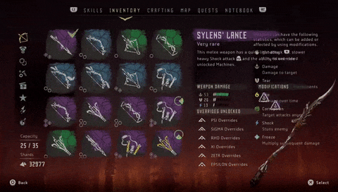
Items called “weaves” can be attached to open slots on weapons or armor which increase stats like resistance, damage dealt, or stealth, to name a few. Though you can see which gear has weaves equipped in the Inventory screen (where you equip items), you had to interact with the weaves in the Crafting menu.
In the latest installment, the menu UI gets an overhaul that manages to add more functionality and information to the same space. Now, this is all done in the same place.
While this seems super minor, many users don’t want to spend time flipping back and forth between different screens to effectively interact with one object. It’s not convenient and it can be confusing – after all, just think about how many people use dual (or better) monitor setups for work.
Especially considering that many prospective users won’t be seasoned gamers, the more fluid your menu, the easier it will be for these folks to adopt your product.
The developer FromSoftware is well known for its tough games like its flagship series, Dark Souls, which has inspired many other great action RPG titles. Their latest title, Elden Ring, keeps the formula close to home while offering several improvements and features.
The last title in the universe, Dark Souls 3, offered several changes to gameplay and slight tweaks to the menu.
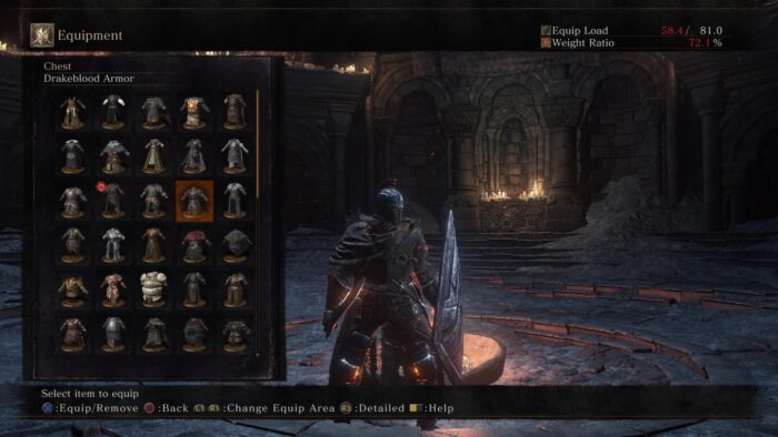
In Dark Souls 3 and prior titles, comparing armor was more tedious because of nonsensical organization.
Though it wasn’t unmanageable, it still wasn’t great. Notice how the inventory is just kind of a series of items with no clear indicators or groupings of like items such as weapon types?
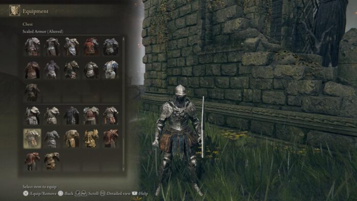
The groupings in Elden Ring make comparing items and equipping new things on the fly much faster.
Though there is still room for improvement, this simple grouping implemented makes a big difference – it’s easier to see when you pick up something new as well as duplicates. In late game, this makes it much easier to navigate your (hopefully) collection and figure out what you’re missing.
It helps distinguish the weapon types which all offer different styles as well as strengths and weaknesses which is helpful for newcomers to the series who aren’t familiar with the system.
***
Note that this isn’t meant to be an exhaustive list as there are all kinds of tasks you can build into a UI. The gist is, keep it simple and make it informative without overwhelming your user.
As a company that’s managed to land five Webby nominations this year, we understand how to research audiences and test designs with the best.
If you want to build a fun metaverse, make sure you don’t get bogged down by a neglected UI in your menu system.