


3 Important Trends to Innovate in Agriculture in 2024
App Design & Development
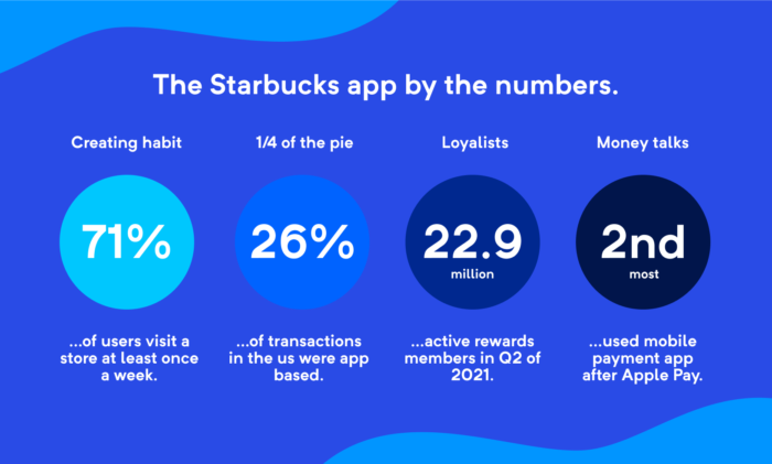
It should come as no surprise that the Starbucks app is one of the best in the QSR space from every angle.
This is why we chose to feature the app during a recent webinar that specifically calls attention to all the little details they nail and what the outcomes yield for their business.
Here, we’re going to highlight the four key takeaways from the webinar you can watch just below.
The app’s end goal is designed to get coffee, among other treats, in the hands of coffee lovers and caffeine addicts alike as quickly and efficiently as possible.
The Starbucks app boasts some impressive numbers – by understanding the overall UX of this app, other restaurants could get closer to this level of success.
You’re likely not going to have the brand presence the company has enjoyed for the last couple of decades and the resulting privileges that come with the territory.
But by incorporating the following elements into your product, you will garner better user engagement which translates to more revenue.
New places can be equal parts frustrating as they are exciting – generally speaking, the more “open” space is, the more inviting it should feel. The same logic works for apps as well.

Unless you’ve never opened an app before in your life, you immediately have a sense of where to go to complete whatever task you have in mind.
Across the top of the screen, users are able to see highly-visible links to their inbox, a handy store locator, recent transactions, and account settings. These items remain near the top as the user scrolls down, which is helpful for those who choose to browse for promotions and such before ordering.
If a user wants to quickly check their loyalty reward points, start an order, take advantage of the mobile payment for an in-store contactless order, all these options are immediately visible.
Though there is some flexibility with the layout, foodservice apps should strive to emulate the same “open floor plan” style the Starbucks app purveys.
Lots of options can be overwhelming if they’re not presented properly – for example, think of the typical ma-and-pa Chinese restaurant menu. More-or-less, the same damn menu is used around the globe as it has been for decades but the deluge of words breaks most of our resolve within moments of opening the menu and we just order General Tso’s Chicken.
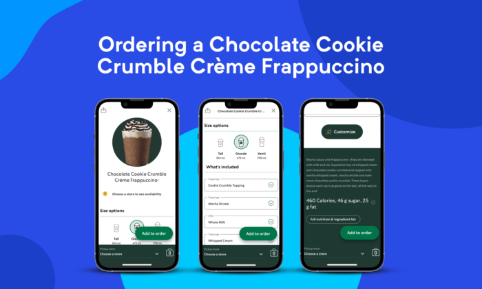
Once you’ve found an item you like, you’re presented with an assortment of context-appropriate customizations options (e.g., you can’t “add cheese” to your Frappuccino) for the product.
They don’t incorporate unique visuals for each ingredient component – something we feel would add immense value to products like the Cold Stone app – but the detailed product picture gets the point across for specialty beverages while descriptors found in each submenu sufficiently describe each option.
They even have an indicator that shows the default option, which is helpful for users that get a little wild with their ingredient selection before reeling it back in.
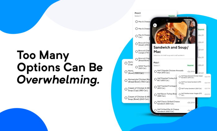
The ability to offer extensive customization options can be overshadowed when your ingredients and such start to look like a Google Sheet a dozen people at your workplace have been using to track everything for the last three years.
For example, Panera’s popular “Sandwich and Soup” that’s a staple for their restaurants looks like total hell in DoorDash which is far cry from the refined deli marketplace vibe you feel in the store.
If you think about how airline miles have essentially evolved into their own kind of currency, loyalty rewards will have a tremendous impact on how users engage with your app.
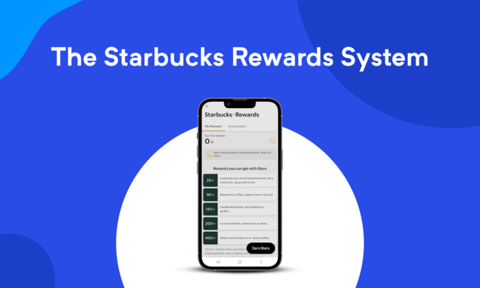
The Starbucks reward system is incredibly flexible in both how customers can earn and how they can apply their rewards. The design is accommodating enough for users to both accumulate points in all kinds of ways as well as spend those points quite liberally. The variety and accessibility make it empowering for users, whether they’re the kind that likes to enjoy frequent, little freebies or save up and go all out every once in a while.
The Chipotle app also offers a similar style that truly empowers people which, in turn, makes them extremely likely to vest interest in the program.
A loyalty program with a good design and accessible rewards almost always yields substantial engagement and retention. Reward systems, like anything that can be gamified whether it’s meant to be or not, play nicely with user psychology which will almost certainly lead to more spending.
And if you think points aren’t all that important, consider that most serious runners are always trying to lower their split times, investors are forever trying to grow the numbers in their accounts, and gamers are driven to get the high score. It’s how many folks are wired so you might as well as give them the tools to scratch the itch because everyone wins this way.
If we backpedal and look at the home screen again, we’ll see that the payment methods are immediately visible – a button to “Scan in store” is immediately visible and the option is always accessible at the bottom menu.
They’ve essentially made it arguable just as easy, if not easier, than it is to reach in your pocket or purse, extract your card, then go through the motions until complete.
Starbucks truly paved the way for mobile ordering as they first introduced this feature in 2009 which was novel for the time.
Since then, it’s only gotten better as you can gather from the video above. Users can take advantage of the de facto standard method of making a mobile payment by linking a card, using a gift card, or by linking to PayPal. Users can also fund their account’s “Reload” payment method which works like a prepaid debit card and earns them double the points.
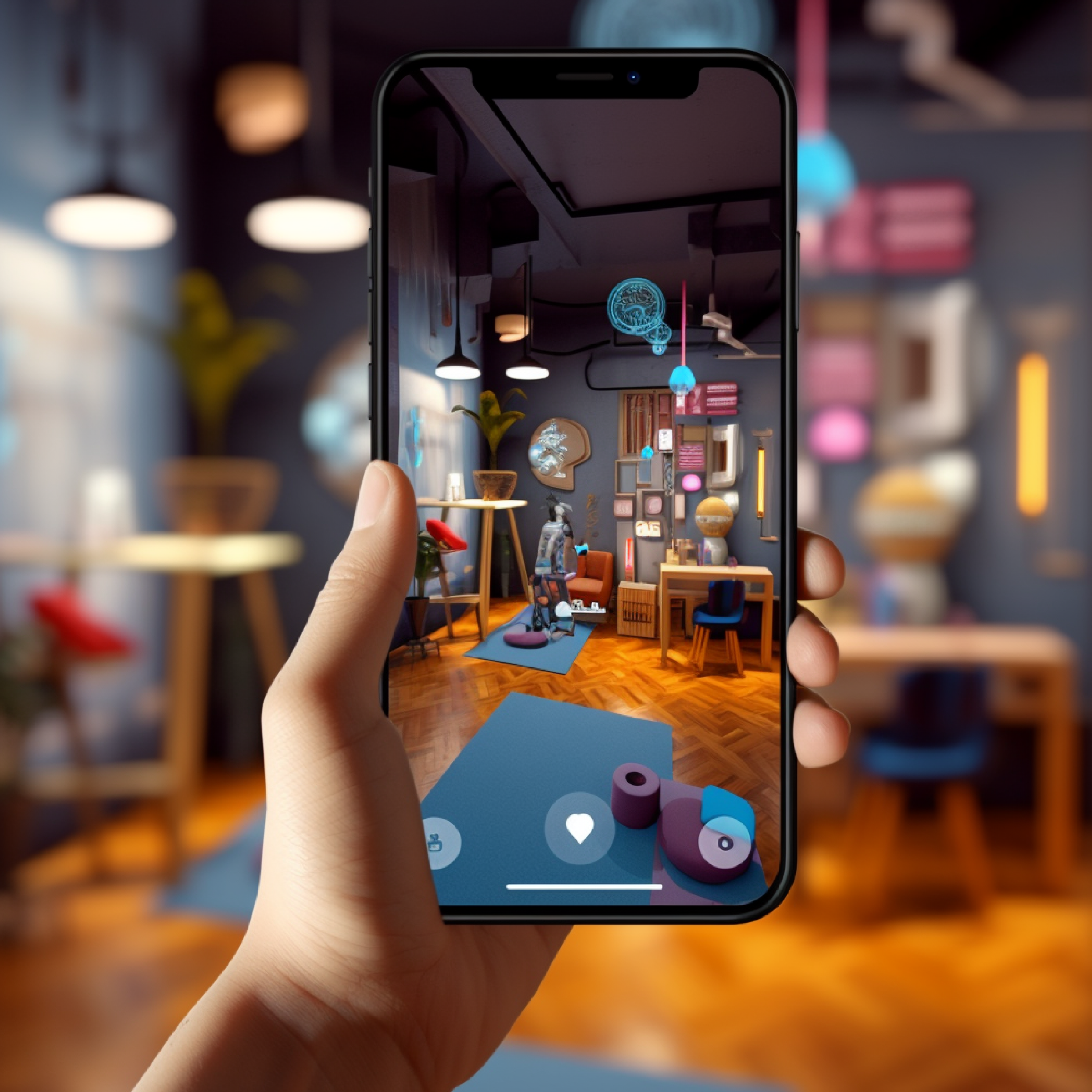
There are a few nice other touches like the ability to quickly add items to your favorites by tapping the heart icon. It’s also quick and secure to use the Reload feature as it connects with Apple Pay or Google Pay, depending on the device.
Sure, Starbucks has a brand presence in the QSR space that’s maintained its momentum for decades but that shouldn’t stop you from using them as a learning tool. Even the most cynical hipster who scowls at anything not locally sourced can’t deny that the Starbucks app is objectively good.