


3 Important Trends to Innovate in Agriculture in 2024
App Design & Development

| Get Our Free Guide – 6 Must-Have Features of Your Restaurant App |
The Cold Stone app currently provides an experience that’s so “meh,” it’s almost jarring – the vibe just from walking into one of their QSR locations gets you pumped to assemble your treat but the app almost makes you want to order a salad instead.
We recently conducted a webinar where we picked apart the Cold Stone app mistakes and then discussed how it could be radically improved through a series of mockups created here by our team. Here, we’ll cover the four main takeaways from the presentation embedded just below.
The app won’t ruin your day, but from a business perspective, the company is missing out because of poor design. Let’s take a look at the most glaring issues and discuss how a little polish would lead to a better experience for everyone.
Do you hear that ringing? That’s Dairy Queen calling, and they want their mediocrity back.

The whole point of ice cream is that it’s a treat. It’s supposed to be fun, which is a trait that Cold Stone is typically known for but none of that “Willy Wonka” vibe comes through in the app.
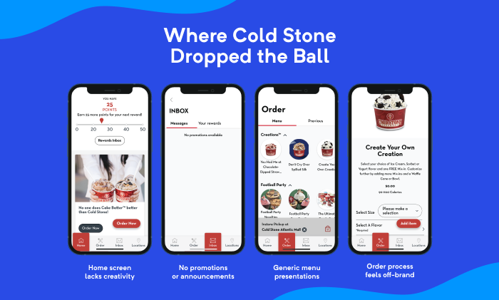
To be more specific, it lacks personalization and doesn’t call attention to anything other than the rewards system. At the time we reviewed it (i.e., a week prior to this blog), the app would take you to an inbox with nothing – there’s now imagery and content to clarify that the user earns a point for every dollar spent where 50 can be redeemed for a $5 savings in store.
If you have an app that rewards users for using the app, you’ll have better luck removing nonsense conditions like “must be redeemed in-store.”
The flat design, lack of a greeting, and static background image give the app this let’s-get-it-over-with feeling which is anything but fun. Rather than display promotions, the user’s past orders (which is popular in apps like DoorDash), or popular items, it launches you right into a haphazardly designed menu.
One problem I experienced that wasn’t discussed during the webinar is the fact that the sign-in process is broken on both Android and iPad.
While this might be a fluke – there is a chance that both of my fully-updated Android devices and iPad are malfunctioning – there are a few other app mistakes within the sign-up process. In the video above, notice how they pair the “agree to terms” and “consent to text messaging” in the same checkbox.
Don’t force users to sign up for marketing communications; always give the user an option, ideally not one that’s “you can turn it off later by blah, blah, blah.” If I or a user get annoyed, we’ll shut it off entirely. And if you have an app, you might as well use it to its full extent and take advantage of a notification system – basically an app’s own little place to reach out to you when it wants something – which can customization on both Android and iOS.
There are a few other small issues like binary choices for gender which should at least include an option to decline – ice cream is a treat enjoyed by everyone so it’s probably best to avoid gendering products and promotions altogether.
Finally, the process doesn’t complete on either platform and it’s unclear as to whether it’s because there’s a communication issue with the server or because it doesn’t like a value input into one of the fields (i.e., some password fields emit certain special characters.)
Apps and websites with a commerce component often include a cart section that makes it easy for a user to see and save their order as well as navigate away to make changes. While you can do this in the Cold Stone app, there are a few design changes that can make this process smoother.

Whether you’re building for the restaurant industry or otherwise, users should be able to follow visual cues to freely navigate the app. Cold Stone creates a gray box just above the bottom menu for your cart once you’ve added an item that features an animated icon that displays the number of items in your cart. Once you’ve opened the cart, you can either move to the payment process, edit items, as well as adjust the number of each item you’ve ordered.
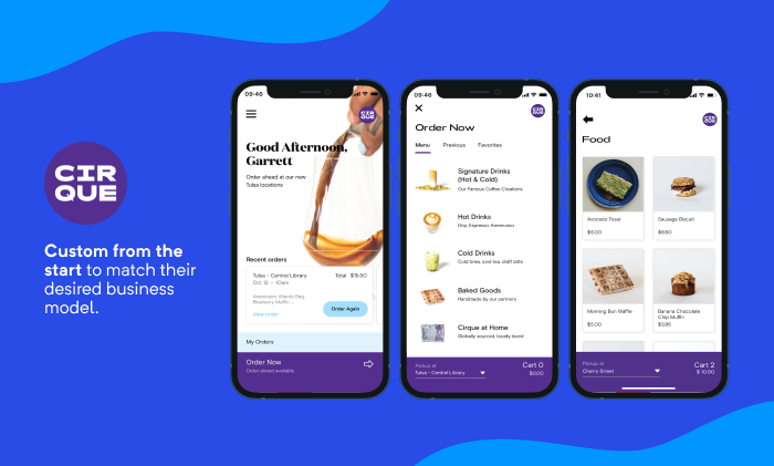
This isn’t a bad start but take a look at the Cirque app that we developed pictured above.
Rather than place the cart icon on a single page, a non-intrusive design like above that can be seen across all pages can improve the UX. This allows the users to keep track of where they’re at with a running total, even if they decide to go to another page, such as the Cold Stone app’s home page, without having to hop back to another page where they then have to open the cart.
Small app mistakes like this, coupled with multiple simple and secure payment options, help users breeze through the process — after all, it’s a lot easier to whimsically spend $50 on ice cream for the family when there’s no friction in the checkout lane.
Once you get past the main menu, it should get better, right?
You’re first asked to select a size between Like It® and Gotta Have It® which is fine when you’re already familiar with their sizing schemes but without a visual or anything other to go on than the calorie range, the volume of what you’re getting is a bit unclear.
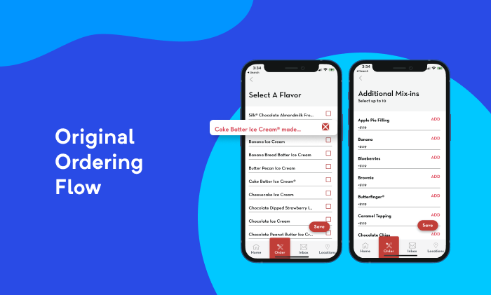
From here, you’re simply given a survey-style list which feels more like you’re helping out a friend in grad school get responses to a questionnaire they made in Google Forms. Some of us happen to take ice cream toppings very seriously but this style more-or-less hurries you along.
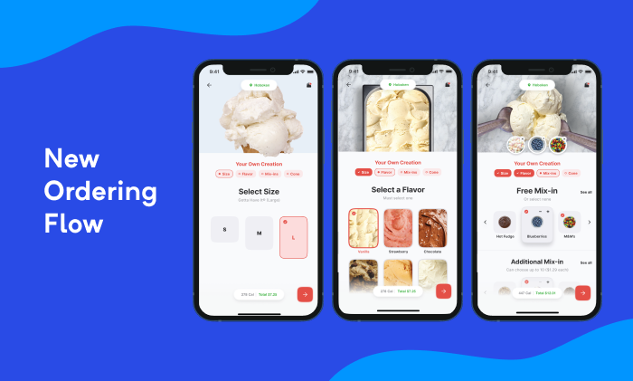
If you want to get people psyched to build their custom treat, visualizations make it a lot more fun. High-fidelity visuals for the base flavors coupled with functional imagery for toppings are embedded into their own elements that allow users to easily scroll from side to side and pick and choose what they’d like to add to their treat.
Visuals (especially those that move!) are much more engaging than a wall of text-only ingredients and it’s becoming the norm in the QSR space. This is ideal for those who want to build something different but need inspiration from visual inspiration.
Though we didn’t test with kids, imagine how much more fun it is for the younger kiddos who aren’t the strongest readers just yet.
| Get Our Free Guide – 6 Must-Have Features of Your Restaurant App |