


3 Important Trends to Innovate in Agriculture in 2024
App Design & Development


It’s interesting how otherwise great restaurants can completely drop the ball when it comes to their digital platforms because of bad app menu design. The reasons why are varied – some non-savvy owners were backed into a corner when the world shut down and then rushed a solution to the market while others half-assed it and everything in between.
Moving forward, what’s important will be continually improving your services as some 88% of users are less likely to return after a bad experience. We’ll first look at some good menu designs to highlight what they do well, then we’ll discuss some examples of when things can go sideways because of a bad UI.
Some of this will be obvious. You need pictures and an explanation of your items, especially when you have a theme in place and creative names for your dishes.
Compared to physical menus, this much stays the same but the layout and “movement” capabilities for the many potential elements you could include in your app might not be immediately obvious.
And unlike your laminated menus, your digital menus won’t corrode from constant cleaning.
When it comes to franchise pizza establishments, Hungry Howie’s smokes the competition. And I will die on that hill.
The Hungry Howie’s app isn’t perfect – there’s plenty of room for improvement but if we just focus on the menu, this part does its job effectively.
Though it takes a moment to “spool up” as there are several preliminary steps (even a couple before the above video begins), the process of constructing a pizza is intuitive. The app walks the user through each section and though it lacks dynamic imagery that makes other menus glisten, if you’re at all familiar with pizza, there’s little mystery to the final product.
There’s nothing special about what they do (at least on the front end), which is the point. They didn’t use an off-the-wall app menu design; they went with something generic that gets the job done.
Interestingly, Hungry Howie’s makes use of both internal delivery drivers and DoorDash in most markets. It goes to show that there is a lot of flexibility with services like DoorDash which also powers the Chipotle app.
The Chick-fil-a app makes use of many modern features that you would expect to see from a franchise their size. They make use of dynamic content in their product which is useful for a myriad of reasons.
This is important because right now, there are global supply chain issues affecting just about every industry and the restaurant industry is feeling it thanks to inflation impacting food prices.

Unfortunately, Chick-fil-a has very little influence over the economy and the suspiciously excessive supply chain issues. But what they can do is make you aware that these situations may impact your experience.
Even though users should be able to put two and two together when they see higher prices or missing items, this little buffer helps manage expectations.
These systems are also useful for good news as well. For example, if you have a “happy hour” with a special menu or pricing, then there’s no better place for a dazzling message than the middle of the home screen after the user logs in.
As one of the oldest players in the mobile ordering game, the Starbucks app is a byproduct of constant evolution.

We’ve thoroughly covered the Starbucks app UX because it hits all the marks and performs as such. They don’t go over the top which makes ordering a product, managing rewards, or mindlessly scrolling through the immense number of gift card options, a pleasant experience.
Whether you’re starting from scratch or revamping an existing product, there’s likely a lesson to be learned from the Starbucks app.
Below, we’re going to take a look at a few examples from DoorDash orders that demonstrate a small cross-section of different issues that manifest in these ecosystems from bad app menu design.
One thing you should always avoid is anything that parallels the “fine print” of a contract. While it’s not always malicious, falling short of expectations can create mistrust with customers.

It’s kind of hard to look away from the meatballs on a second look so I’m not surprised I messed up.
I recently ordered the above without much more than a glance – between the price and picture, I expected there to at least be a few meatballs but to my dismay, there were exactly zero meatballs.
Though this is ultimately on me, I would have happily paid their meatball fees rather than receive the $40 trough of noodles and sauce I ended up with. Most likely, others have experienced this same issue but unfortunately for Carrabba’s, DoorDash only allows for a single static image.
In most cases, you’re best to picture the base product unless you make it clear that certain portions are “sold separately” like our childhood toys.
If you order from DoorDash frequently, you might experience issues from time to time such as delays during peak periods or when there are issues with suppliers. However, obvious carelessness is irritating from a customer’s perspective.
Here’s DoorDash telling some little fibs.
A couple of things went wrong here. Someone forgot to “turn off the lights” for the local Jet’s Pizza on DoorDash on a day I happened to place an order.
About an hour passes and I look into the matter myself which as you can see, the store is closed. The DoorDash app then states it’s having trouble finding a driver for an order that’s never going to be made.
Here, the DoorDash system should be able to detect these issues to perform corrective issues before a hangry customer has to contact support.
Of course, none of this would have happened if Jet’s would have configured their store hours correctly. Sometimes, a business makes mistakes no matter how many reminders and callouts you provide them so it’s important to be able to resolve issues quickly which DoorDash is usually good about.
Chipotle might rule the burrito world on a national level but locally, Puerto Vallarta Express serves nothing short of magic in-store and through DoorDash.
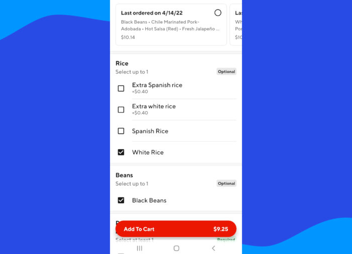
Even though they’re usually impeccable, a couple of things surfaced recently with “missing” items from the menu (not items that are being impacted by current food shortages.) In a past order, the option for regular white rice was missing and in the one pictured above, the option for “pinto beans” is nowhere to be found.
Usually, these kinds of things happen after making changes or optimizations to the layout of the app menu design in the DoorDash backend. As such, it’s a good idea to double-check both from your end and the customer’s end just to make sure you’re looking at every angle.
One other thing to note is that paying attention to customer reviews can help resolve these issues quickly – I mentioned the “white rice” issue in feedback just a couple of days before the order pictured above was placed so it’s nice to see the issue was resolved in short order.
Mobile ordering and delivery have a lot of moving parts but none of these underlying complexities should surface in the mobile ordering app.
Further applying good menu management and delivery practices will help your business increase rapport with customers and yield more overall business.